Student Files / BYU–Idaho


Context
Varied
Client
Students of BYU-Idaho
Date
2012-2015
Deduction
This is a gallery of work completed under my direction by undergraduate design students at Brigham Young University–Idaho.
The first project of the semester taught the concept of seeing type as shape. Students were asked to complete a composition using only type shapes. Using Neue Haas Grotesk and Garamond, they were to study the type anatomy and use their knowledge of design principle to create an interesting, abstract piece of art.
The second project of the semester took the student's newfound knowledge of "type as shape" and applied it to the creation of a typographic monogram. The students were asked to create a cohesive stationery set based on that monogram. They were to study the shapes on the pages and the texture within.
The third project built upon the second by asking the students to create a large poster based on a long list of their choice. The poster was to be primarily typographic and they were to study the shapes on the page as well as the texture and typographic hierarchy.
The fourth project of the semester asked the students to create a website with strong typographic hierarchy. The header of the website used the idea of space and meaning and set the foundation for the website grid.
The fifth project of the semester was the capstone project. The students took all that they had learned about shape, texture and hierarchy and applied it to the creation of a 12-page typographic booklet. The skills learned and solidified through this project were the use of a grid and good pacing. The cover used the idea of typographic space and meaning to communicate the concept of the book. The concept was then carried through the rest of the booklet using thoughtful typography and form.
Student Files / Academy of Art University


Deduction
This is a gallery of work completed under my direction by MFA Graphic Design students at Academy of Art University in San Francisco.
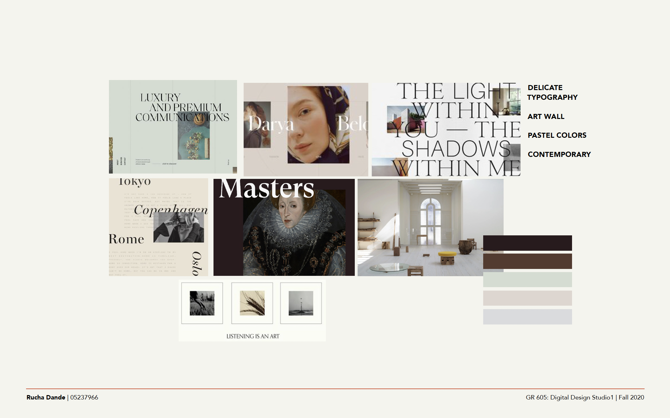
Students were tasked with a semester-long digital growth project; planning, developing, and designing a website. Choosing a business from their local community, they walked through all the strategic steps that led to the design outcome. They wrote briefs based on a client discovery session, then wrote a proposal. They developed personas and scenarios and then created a site map. They drew storyboards for usability and generated mockups before moving on to wireframes, moodboards, and type studies. Finally, they generated mock-ups for both desktop and mobile.
The final presentations were the culmination of the semester’s research and design development, not unlike a professional presentation by a digital agency. The Digital Design Studio course brings the best of two worlds together; marketing and creative. Within the commercial world in which we live, what good is design without marketing strategy?
Context
Varied
Client
Students of Academy of Art University
Date
2022-2023